
Shipped
A new look, and a public site that loads fast
One set of brand colours and type across the app, and public pages rebuilt as static files with no framework to download.
August 3, 2026
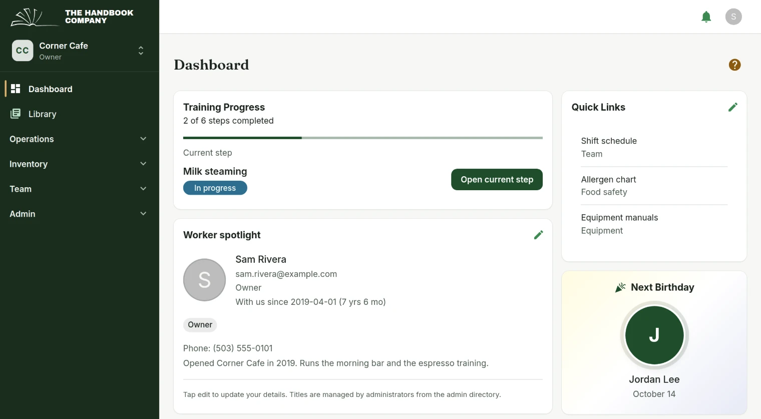
Two products wearing different clothes
The app and the public site had drifted apart: close enough to look like a rendering difference, far enough that a screenshot from one did not match the other. The secondary colour steps were literally different values.
What changed
- One source of truth for brand colours and type, read by both the app and the public pages, with contrast measured rather than assumed.
- The public pages are prerendered static files. No framework is downloaded to read them, and the text is in the HTML, which matters for anybody reading the site through a search engine or an assistant.
- Public pages hold the light colour scheme rather than following the device, because a marketing page rendered in a dark theme it was never designed against looked broken rather than dark.
- Twenty-four generated landing pages became a handful of written ones. Pages with nothing distinct to say stayed thin no matter how the copy was rewritten, which is a lesson worth keeping rather than a page count worth restoring.
Platform
Tell us what to fix next
Everything on this page started with somebody saying something was awkward. Questions count, and so does telling us a thing is harder than it should be.